Background
TalentGuard was a pre-existing software that was basic and unorganized when purchased by the current start-up company. While the intent and purpose of the software was beneficial and had great potential to be profitable, its structure and user interface needed a major update. The software encompassed a large chunk of information and was split into several different modules.
Challenges & Goals
The structure and design of the modules are outdated and need better organization of information while simplifying the usability. The first goal of this project was to focus on one module, Career Pathing, and use it as a standard for the remaining modules.
Users & Audience
The challenge in determining a user group for this project is this software benefits on both the executive level as well as the employee level. Seeing as how usability was such a large focus on this project, a majority of user testing and feedback came from HR employees and department employees.
Solution
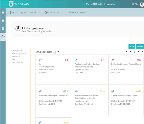
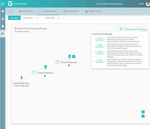
o Added a side bar main navigation and made it collapsible to provide more screen space for the large amounts of information that needed to be displayed at times.
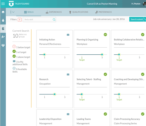
o Converted all the lists and charts for employee and manager information into expandable tiles with summary information for a quick glance into that individual. Tiles could be expanded for more information and click through to their work profile.
o Designed a whole new minimalistic icon set to better align with the new modern look of the layout.
o Created and designed a welcome walk through wizard for new users based on weeks of real human user feedback and A/B testing.
o Enabled full branding customization for clients including adding logos, color, and background imagery.