Analysis
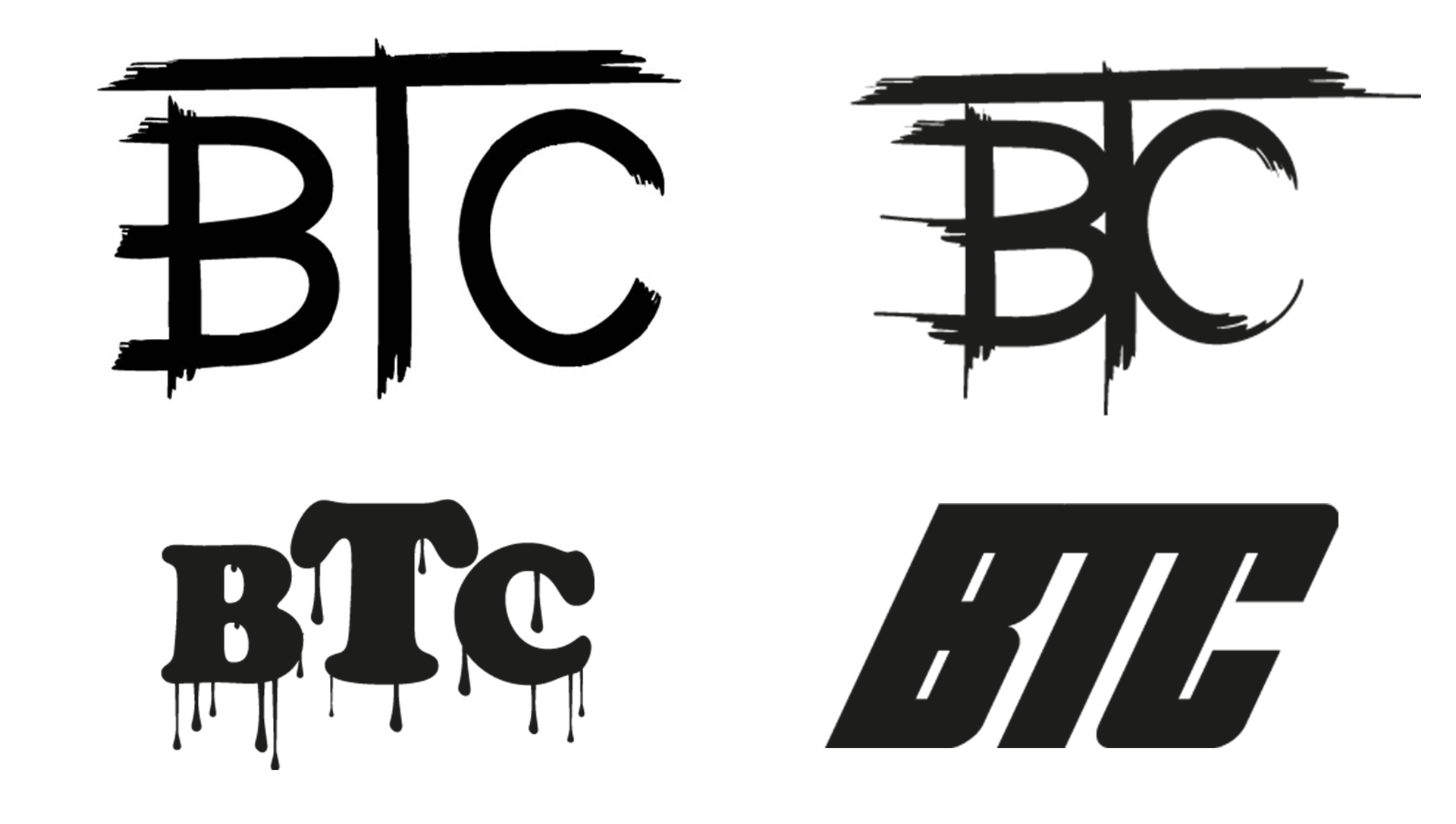
The current logo for Beyond The Canvas is primarily an acronym for the business title. The type face is rough and rugged to accentuate the use of paint or a brushstroke. This coincides with the product of the business and is appropriate for the brand. However, the texture is too chaotic and is an otherwise primitive cave painting. The “T” towers over the “B” and the “C” making it a focal point for the design though it is a mere conjunction in the company name. It makes a clear separation of the “B” and “C” only to add to the ideal of a cave man painting during the era B.C. The full name is spelled out below the acronym design in a narrow font with uneven kerning causing the words to run together and making it difficult to read briefly. Because of the texture of the large letters, it could cause problems to recreate the branding on other mediums.
Objectives and Solutions
To generate a better defined logo, the typeface must be reconsidered as it is too rugged. A solid brushstroke font with less breaking up of the brush to canvas effect would be more efficient to better define the letters and giving it a more professional look to the font. By separating the acronym letters more and placing the “T” even with the X Height would bring more focus on the larger representative letter’s“B” and “C”. Possibly overlapping the kerning would keep the sense of a hand painted logo and still project the product the company has to offer.Eliminating the full spelling across the bottom of the logo allows for focus on the acronym, forcing more focus on the branding. If the title is to be spelled out, it should be considered as an alternate logo without the acronym. The two tone color pallet works well and can be altered for hue, but no additional hue should be included.
Consumer Perceptions
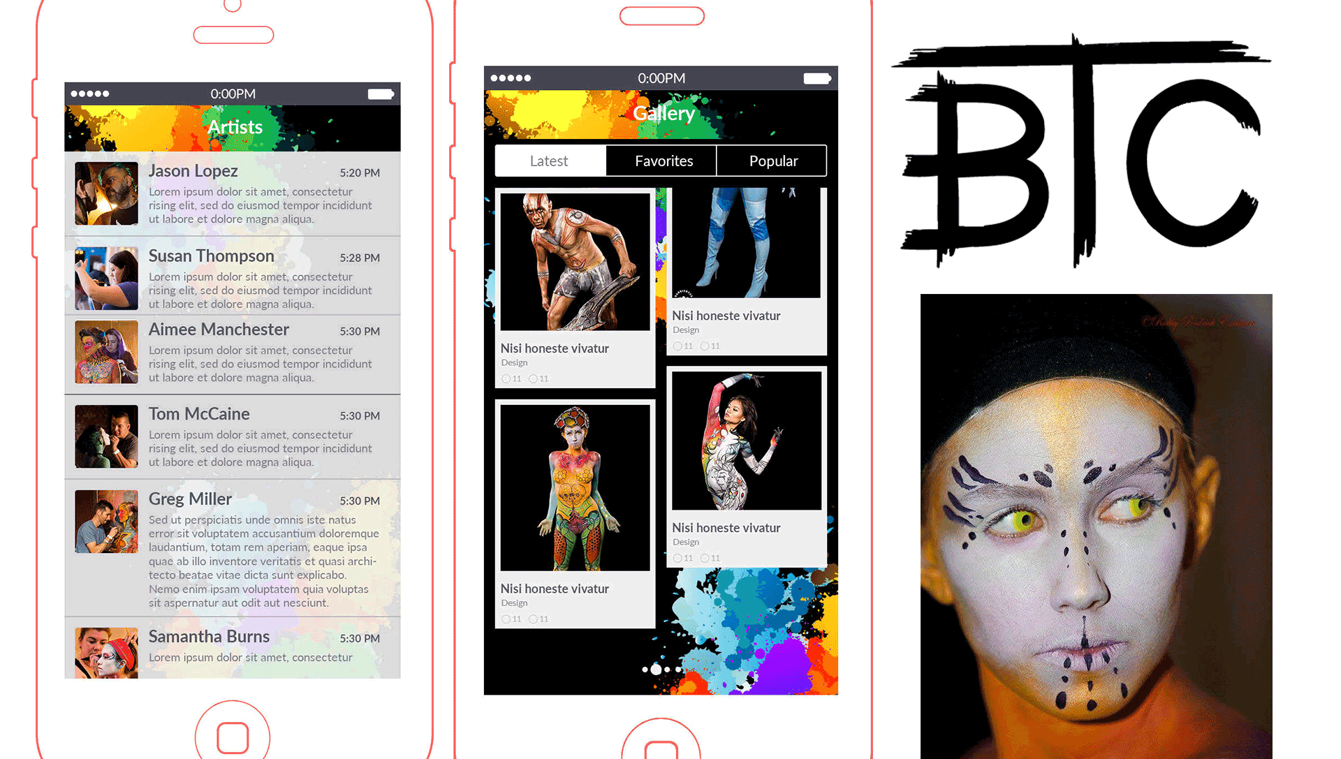
Because the branding for Beyond The Canvas is still relatively new, the current logo is beginning to take hold to the company. It has been seen by many other companies at expositions and competitions in the greater central Texas area and surrounding states. However,because the company is currently expanding their product service beyond body canvas art to include education, now is an excellent time to rebrand the logo design to incorporate the new, more professional approach to their artwork. The response from customers has been overwhelmingly popular according to their social media and the current logo is being recognized outside of their competitions.